Urban Texture Studio specialises in custom architectural laser cutting concepts — signages, elevation cladding, safety gates, staircase railing, decorative screens, privacy screens, garden screens, corten screens, outdoor landscape screens, wall arts, murals, furniture, etc.
- Home
- Portfolio
- Brand Language
- Urban Texture
Urban Texture | Visual Brand Language | With Vichithram Studios
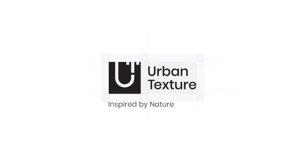
Urban Texture
Inspired by Nature
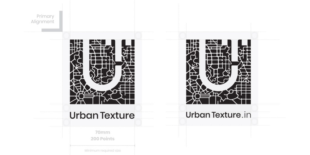
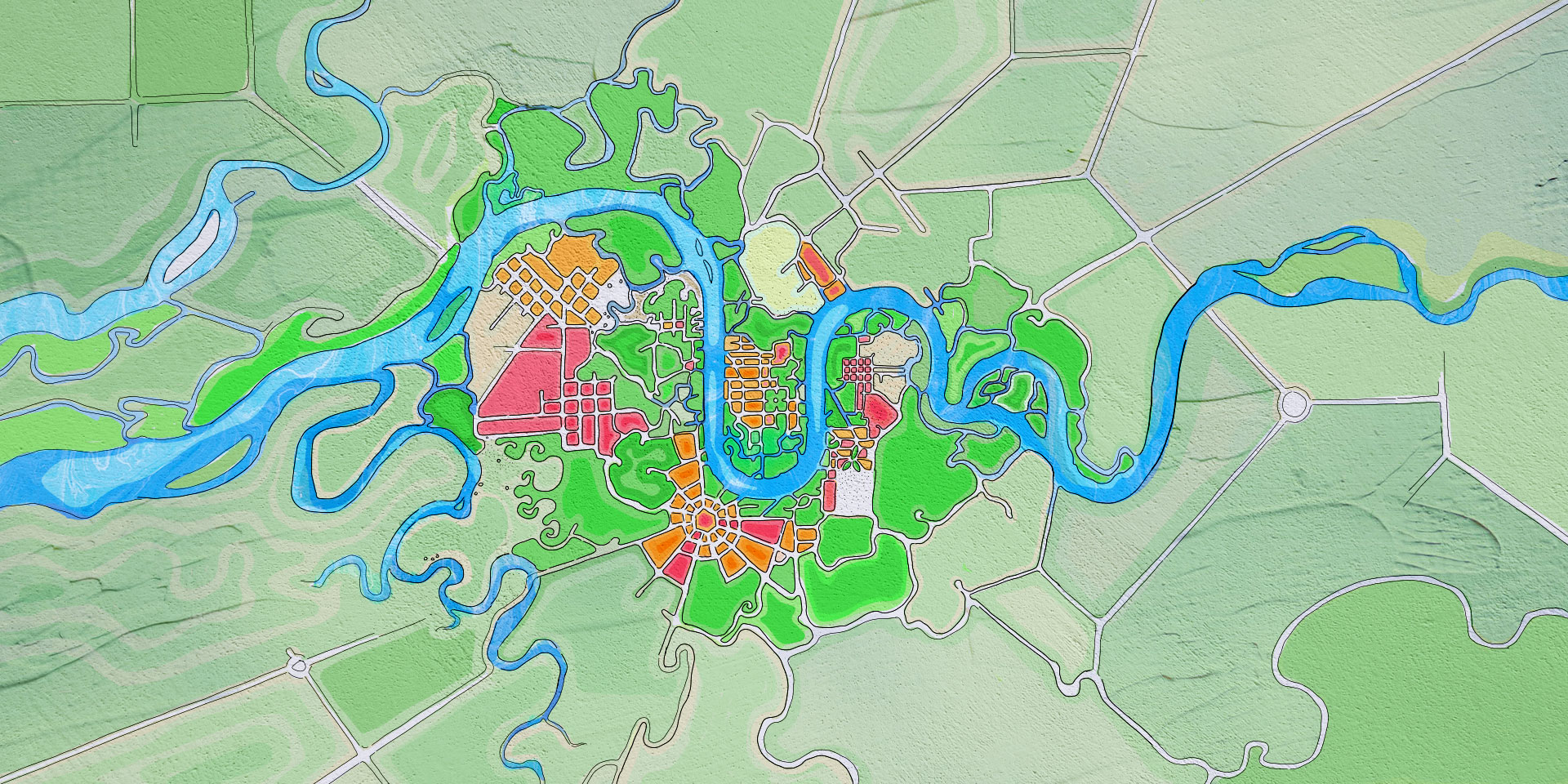
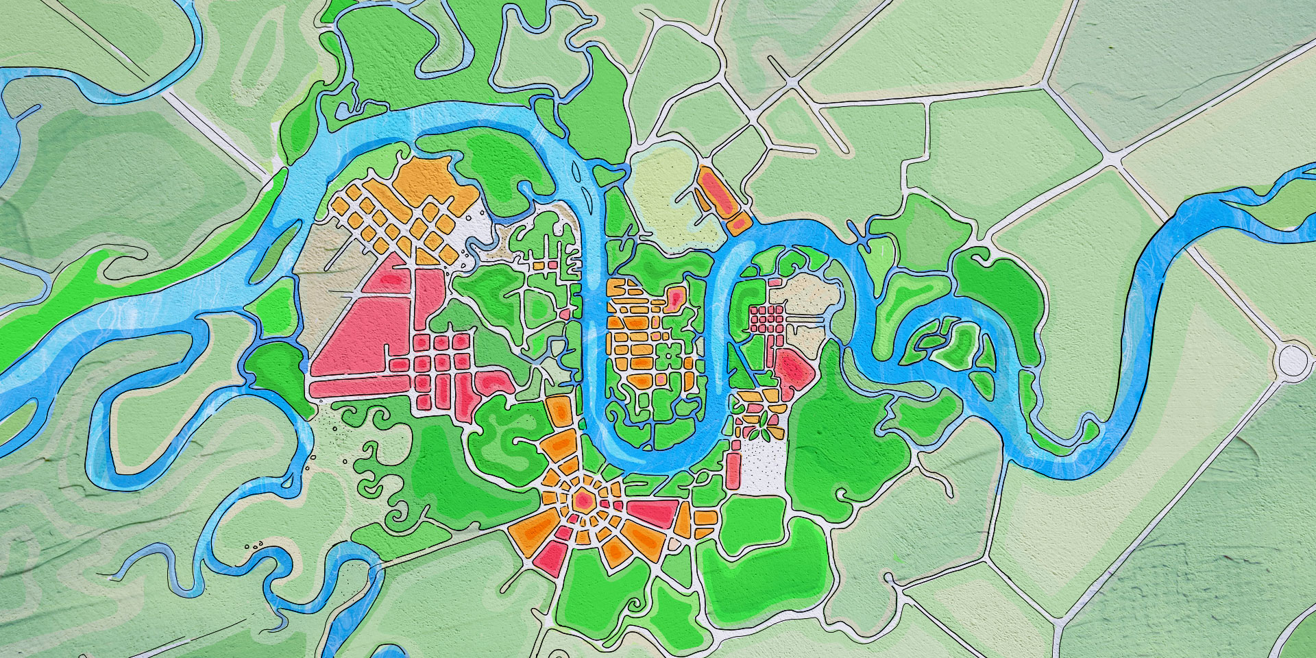
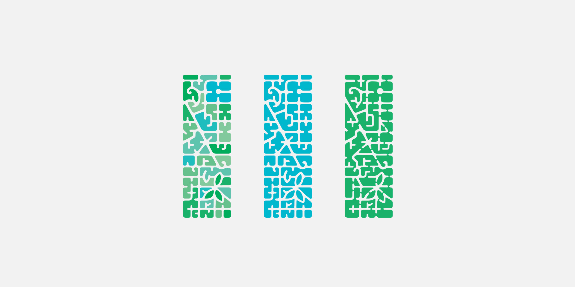
A shape evolving itself from the complex organic landscape to a simple most geometric form. It has come along in shape like a river finding its way out through the landscape. Each intricate and complicated details collectively contribute to the most simple identity.
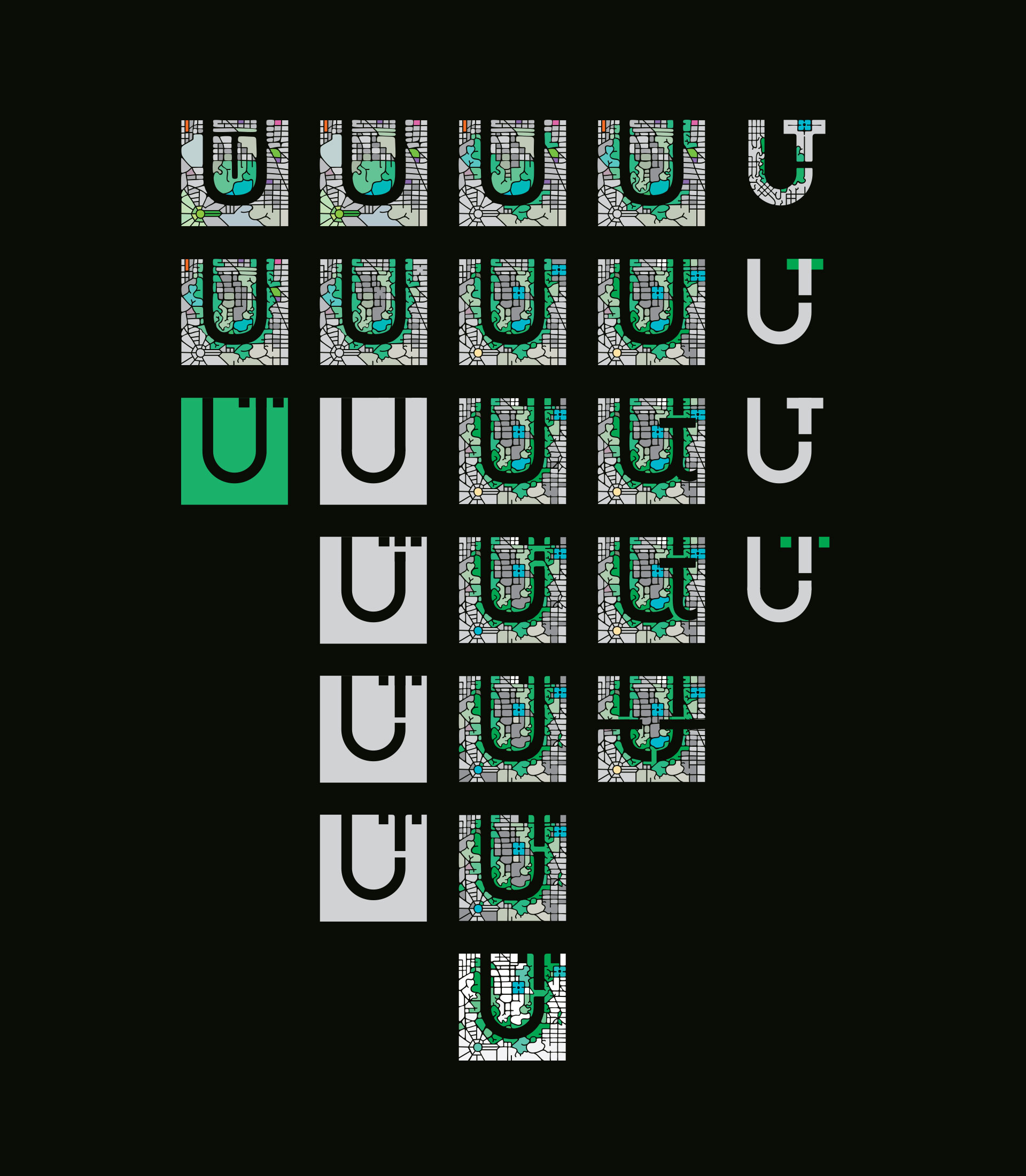
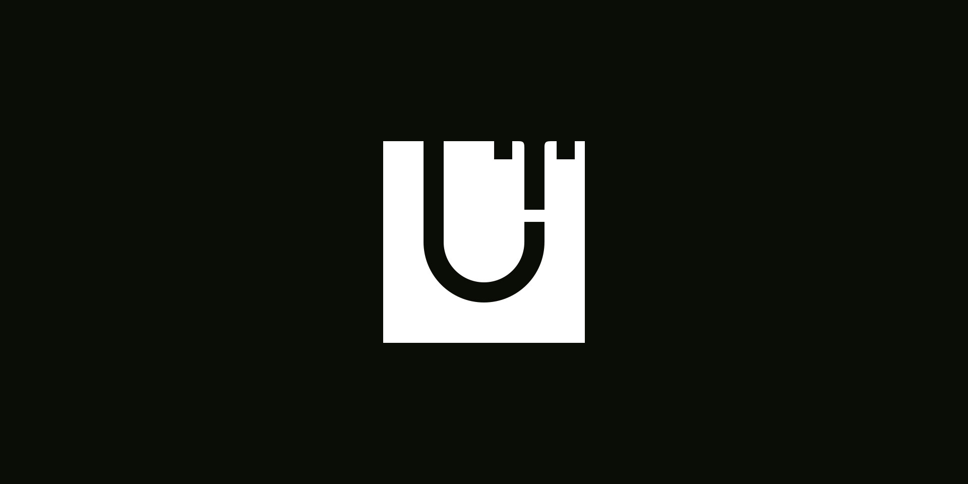
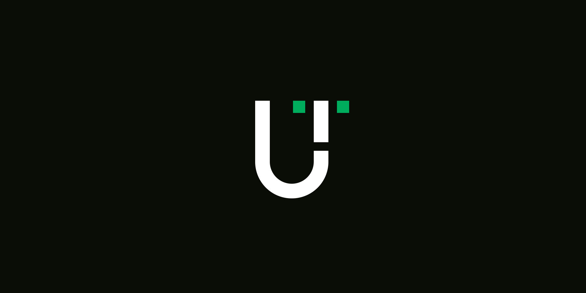
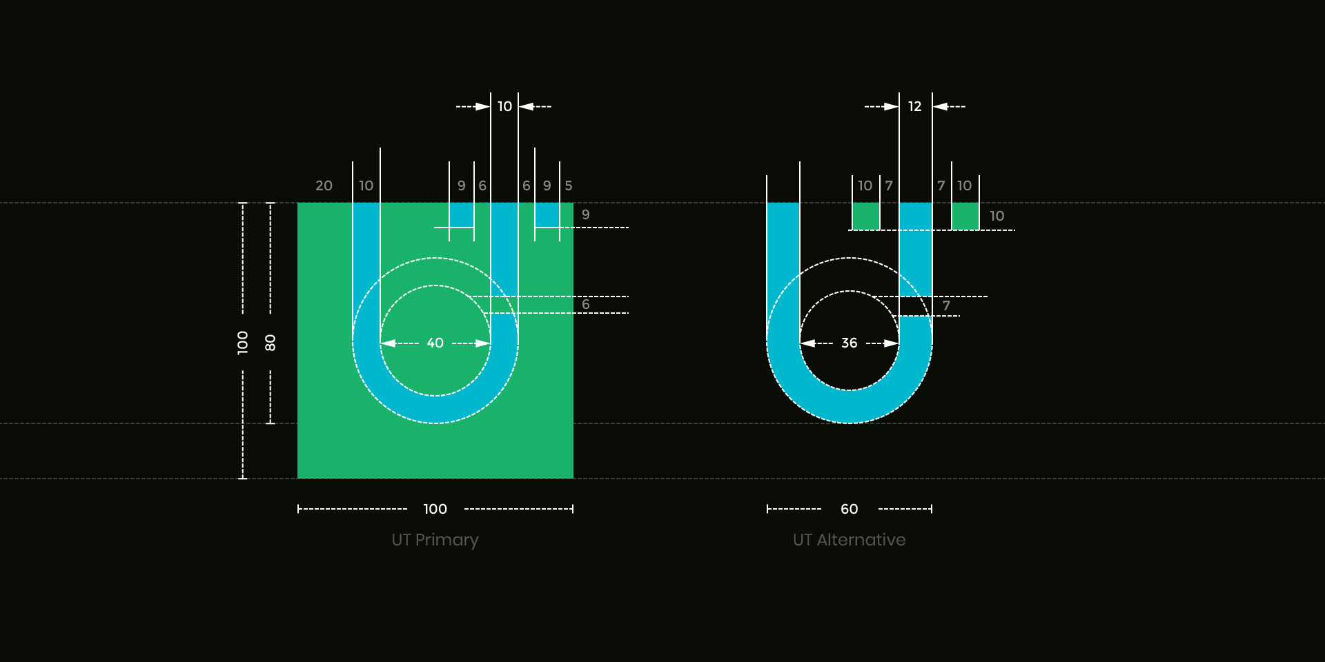
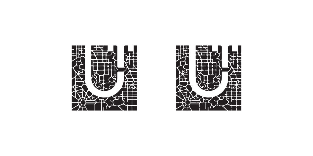
UT Simplified Signature
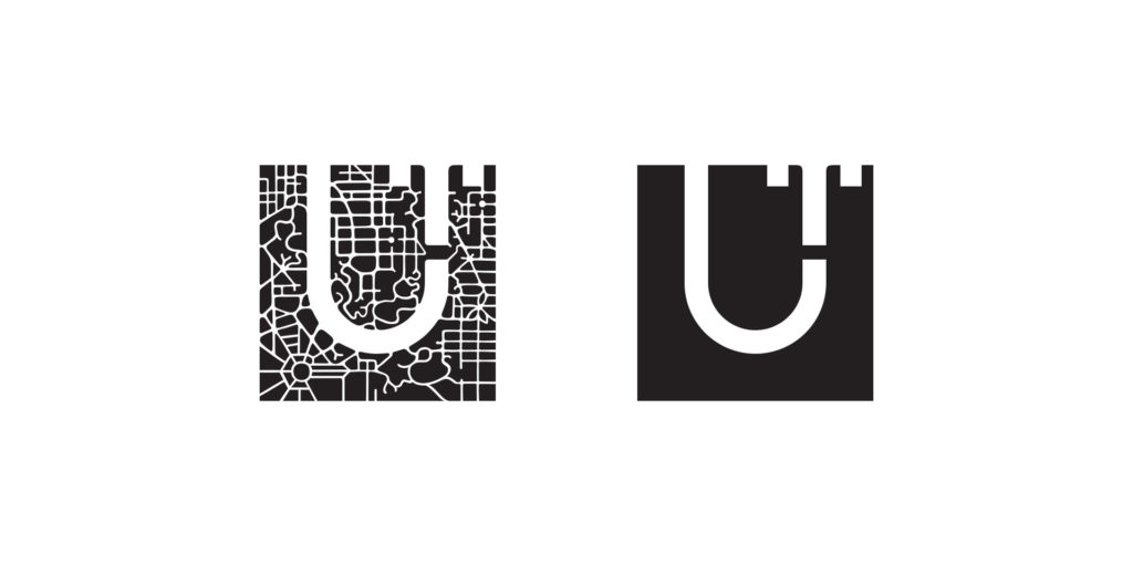
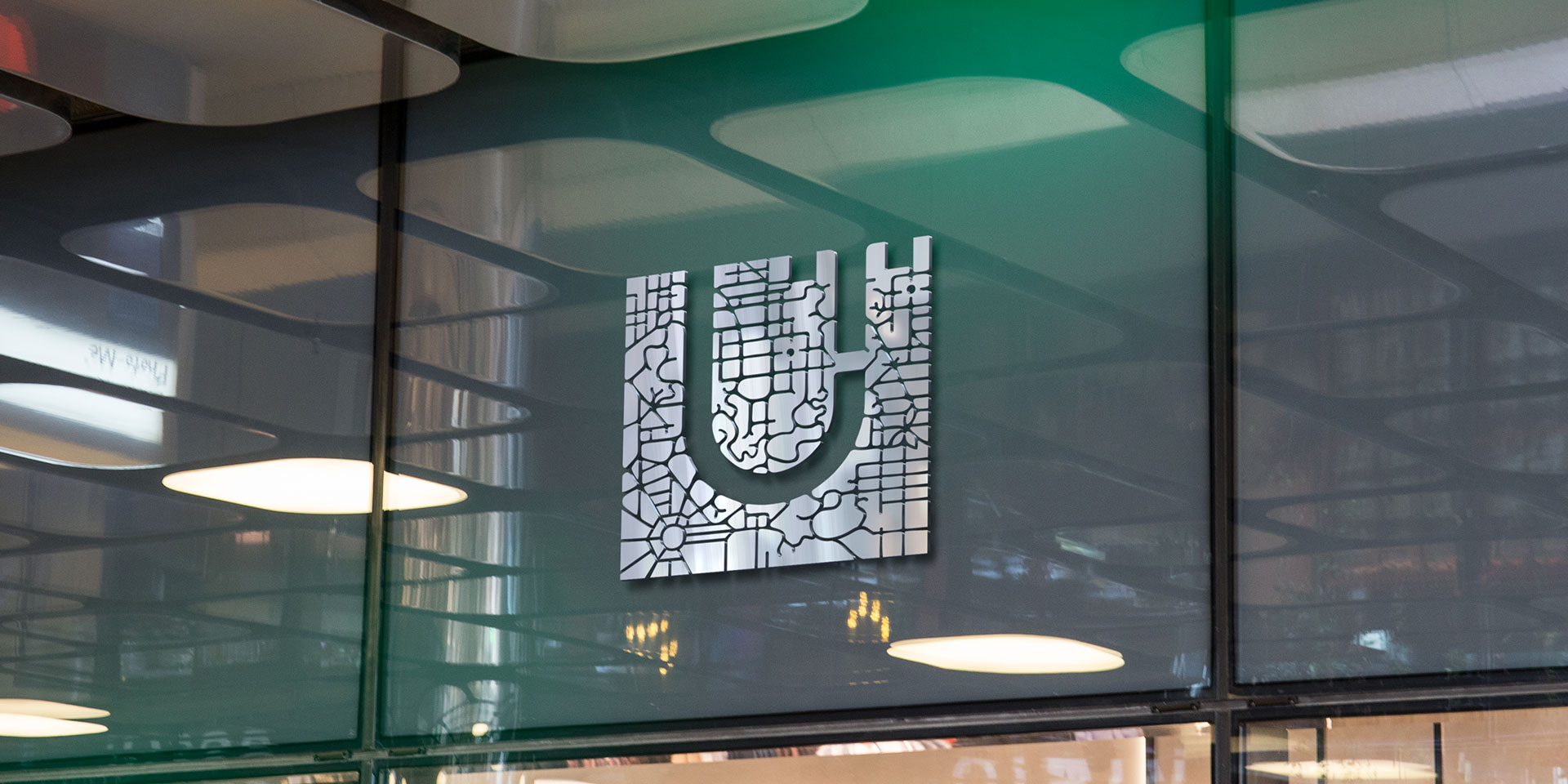
The primary and alternative simplified versions of the UT symbol are designed for the corporate signature in print and digital applications. Both positive and negative forms are constructed with the most basic geometric shapes optically corrected for better visual balance.
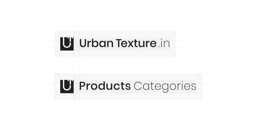
UT Corporate Applications
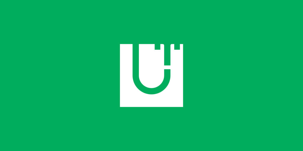
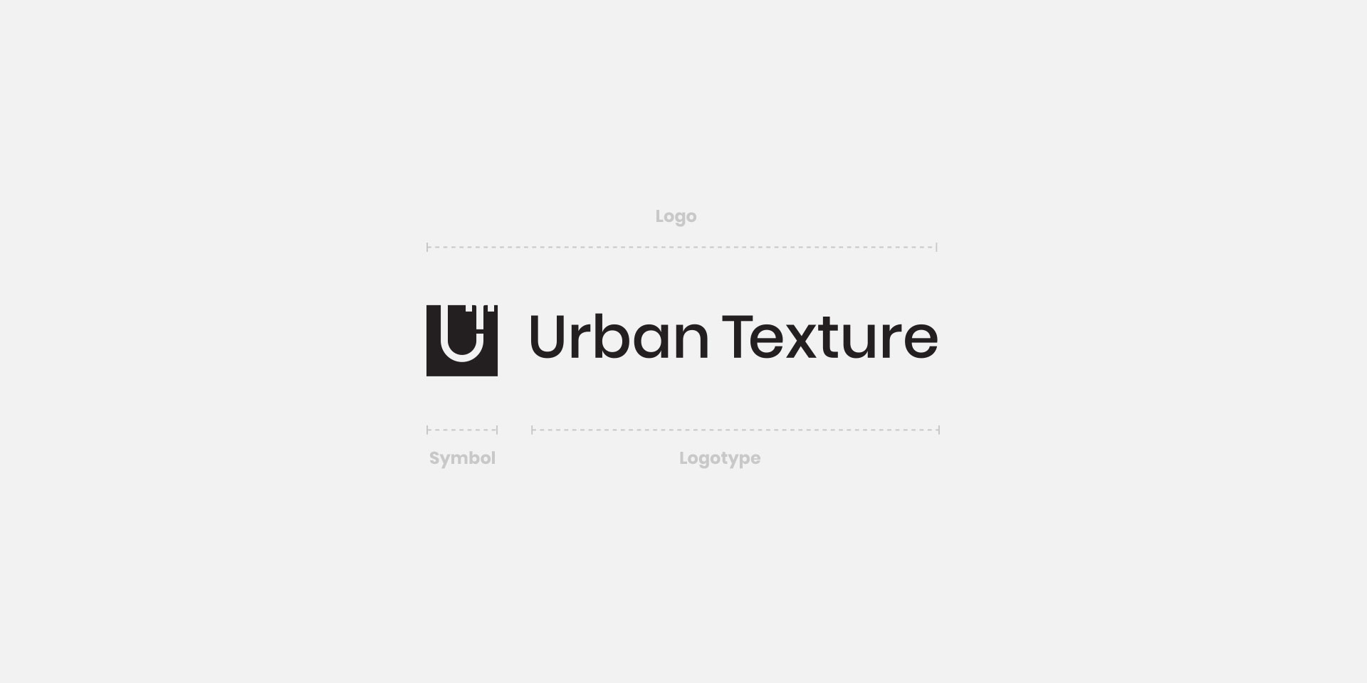
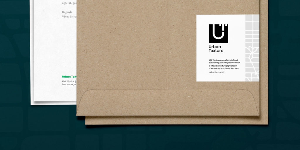
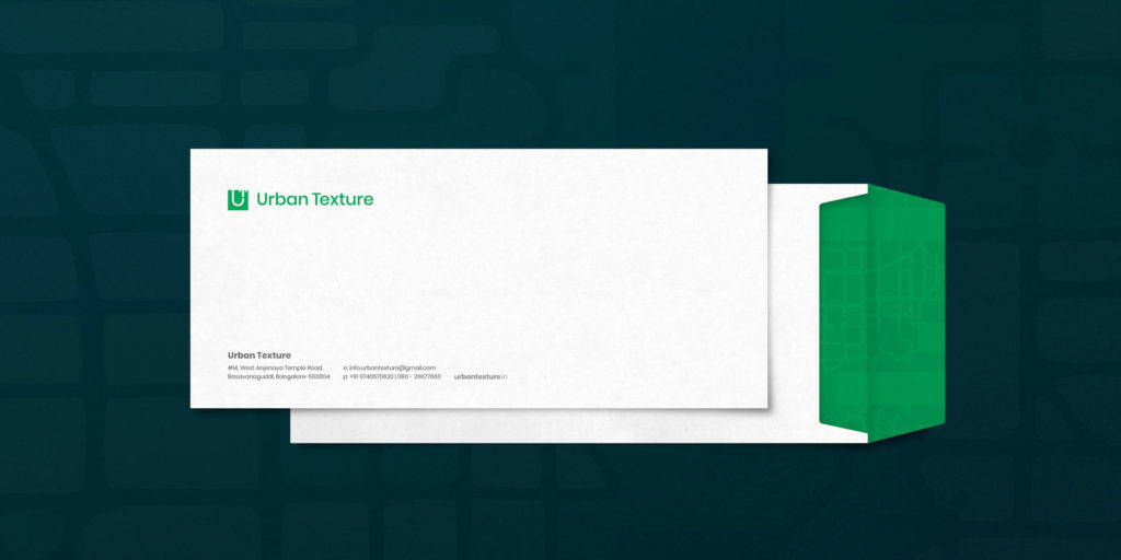
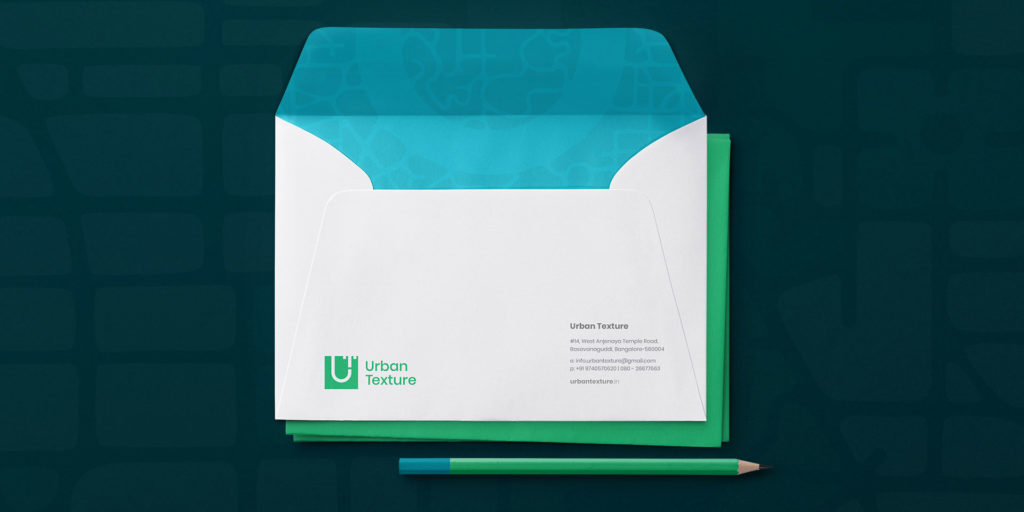
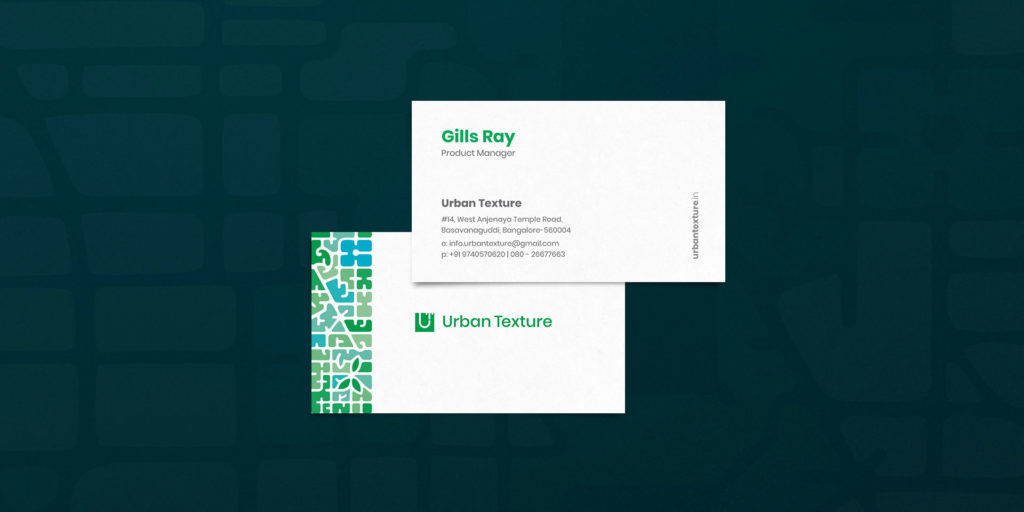
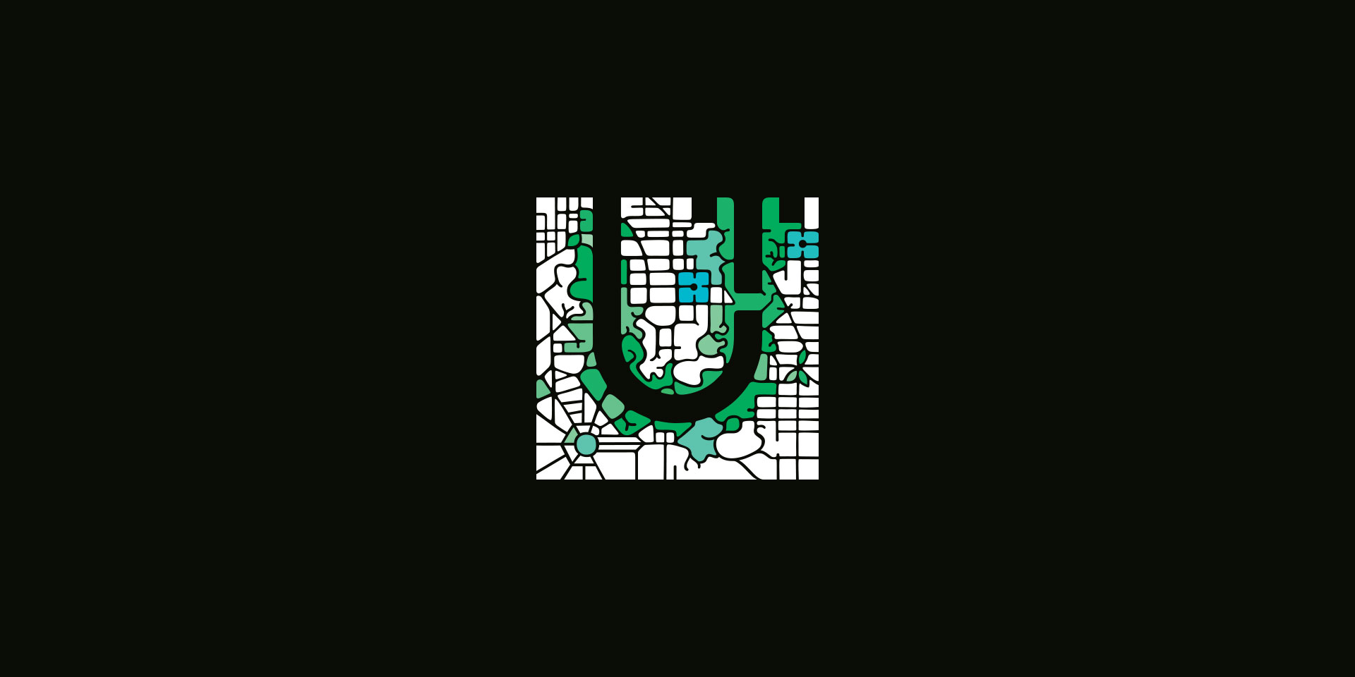
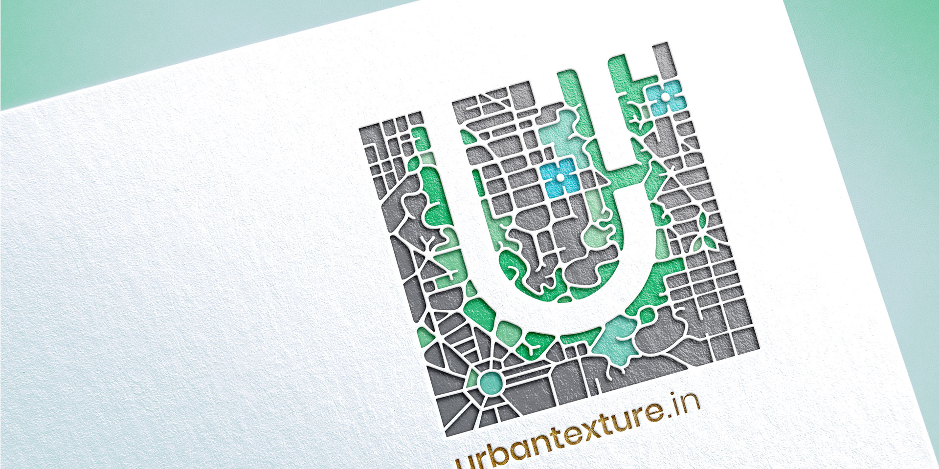
The corporate logo has two components – the symbol with UT inside the square intended to symbolize the company’s profile in urban nature. And the logotype that is always to be used along with the symbol. Both together are described as the corporate logo for Urban Texture. Poppins by Indian Type Foundry and Cormorant Garamond by Christian Thalmann are the typefaces used for all products and marketing communications.
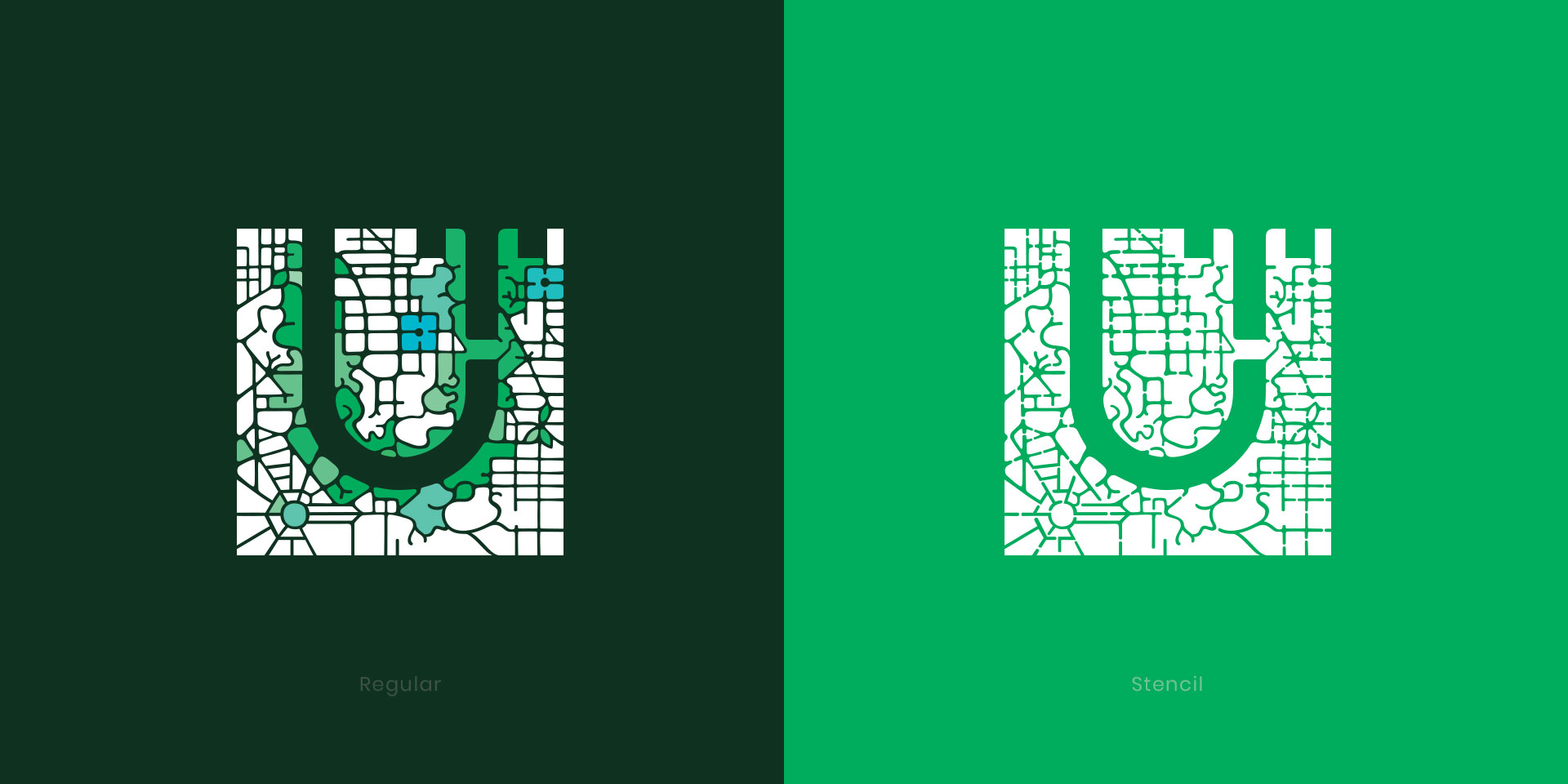
Regular Vs Stencil
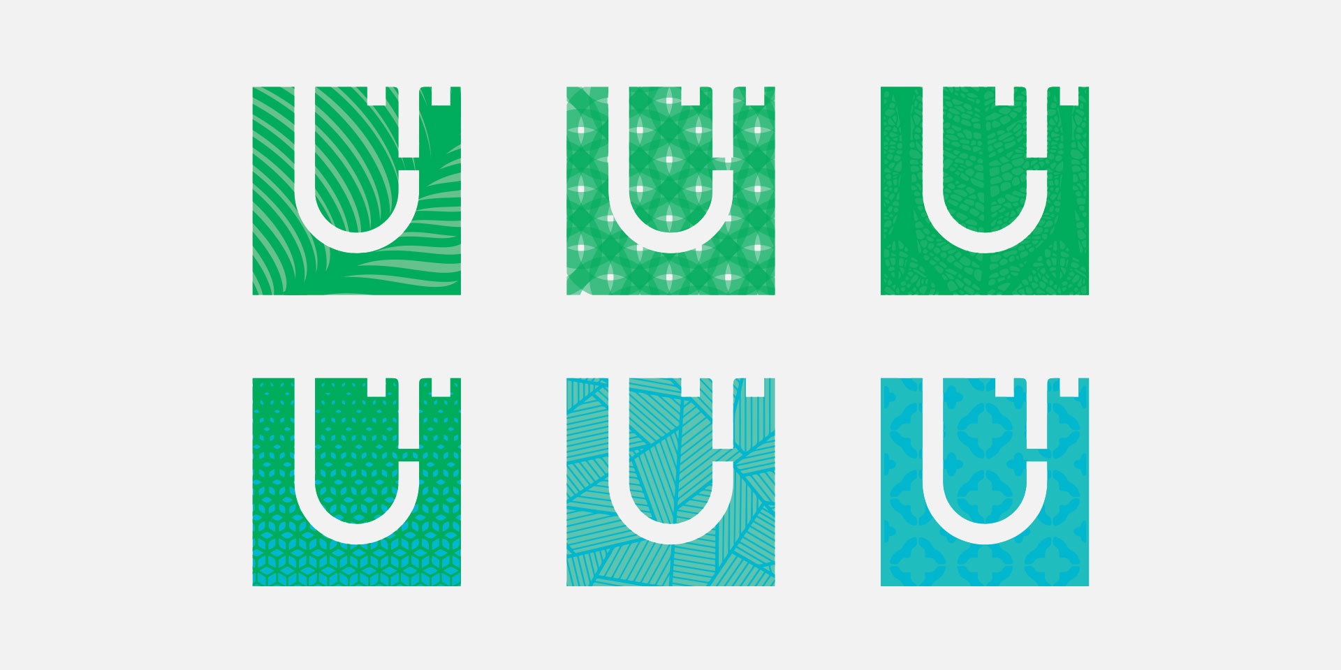
The stencil version of the symbol is an alternative version of the symbol. It is designed especially for the laser-cut, wallpaper graffiti, cutout, mask, alternative screen printing, single colour or gradient colour print experiments. Though the form gets disturbed a bit by the added extra intricate details to make it a stencil. It still carries all the identical visual essence of the original UT symbol.
Related Design Projects
Red Rose typeface
Locals of Mumbai
Wholly Cow
Mind On
Eves 24
Karauli Diagnostics
Holista Music Festival
Rowdy typeface
Dashboard typeface
Gold typeface
Poison typeface
Raag Desh
Firangi
Dream Caster
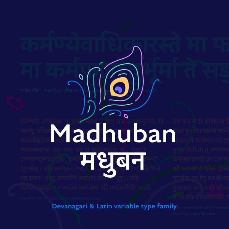
Madhuban typeface
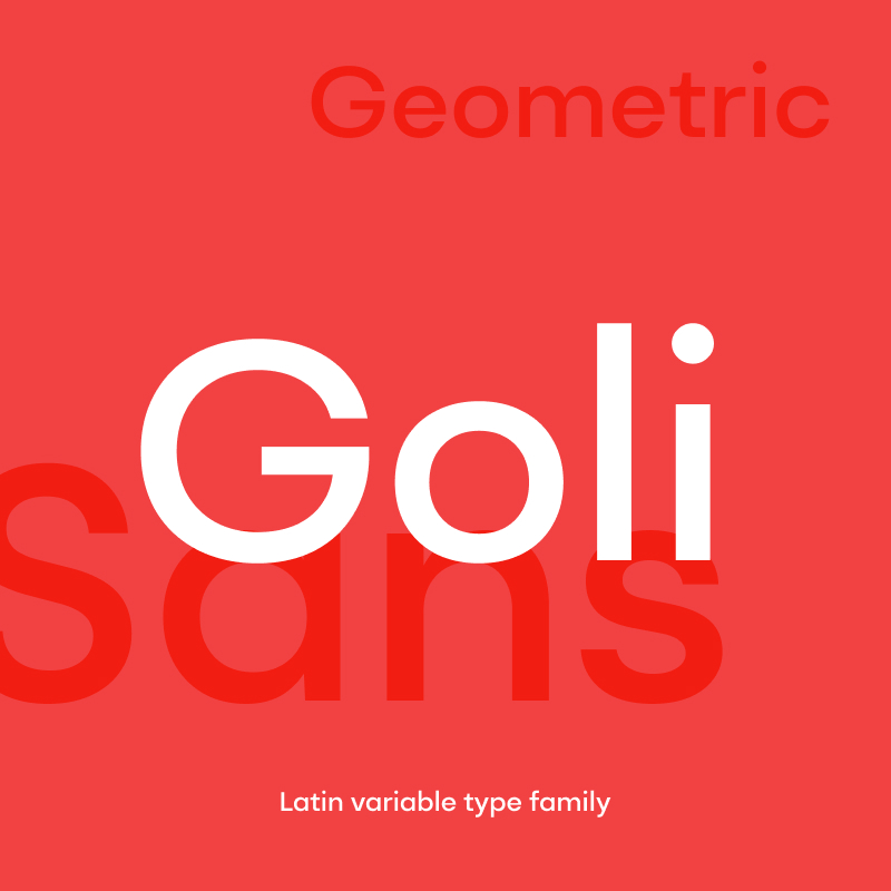
Goli typeface
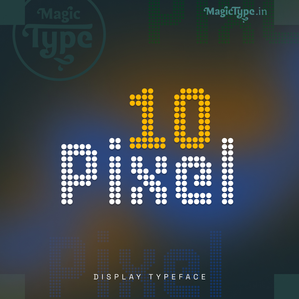
10 pixel typeface
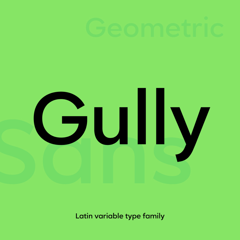
Gully typeface
Scuti
Nayi Dilli
Redwood

Hire Seat
